In Atizay by Jae, authenticity and creativity are at the core of everything I do.
Everything I create is a testament to my commitment to embracing unique perspectives and celebrating individuality.
It’s a reflection of my dedication to embracing diversity and innovation.
Atizay by Jae—a brand born from authenticity and driven by creativity.
I treated the rebrand of my own creative enterprise as if I was starting from scratch. I wanted to create something that truly represented me, highlighting the stress I place on authenticity in everything I do. The conceptualization for this project was so much fun, as I was my own client and set no boundaries for myself. While proud of where I’ve landed, I’m constantly inspired and look forward to the next iterations of Atizay by Jae.
The Logo
Atizay by Jae is a direct translation to “Art by Jae” in my native tongue, Haitian Creole. Growing up, I was exposed to incredible paintings of Haitian characters and landscapes–famously colorful and integrating texture, which inspired me to create art myself.
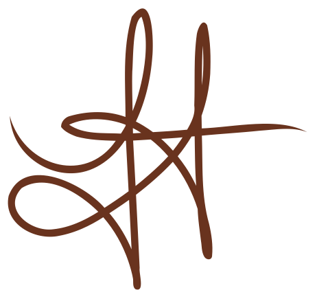
The logo for Atizay by Jae is my own handwriting, a cheeky integration of my style and individuality. The typeface under my handwriting is Brandon Grotesque, sans-serif, casual and friendly, just like me!
Other logo elements include a full typeface logo in Playfair Display, as well as handwritten initials.
‘JA’ in my artistic attribution style, and ‘J’, in the style of the handwritten logo.
Moodboard
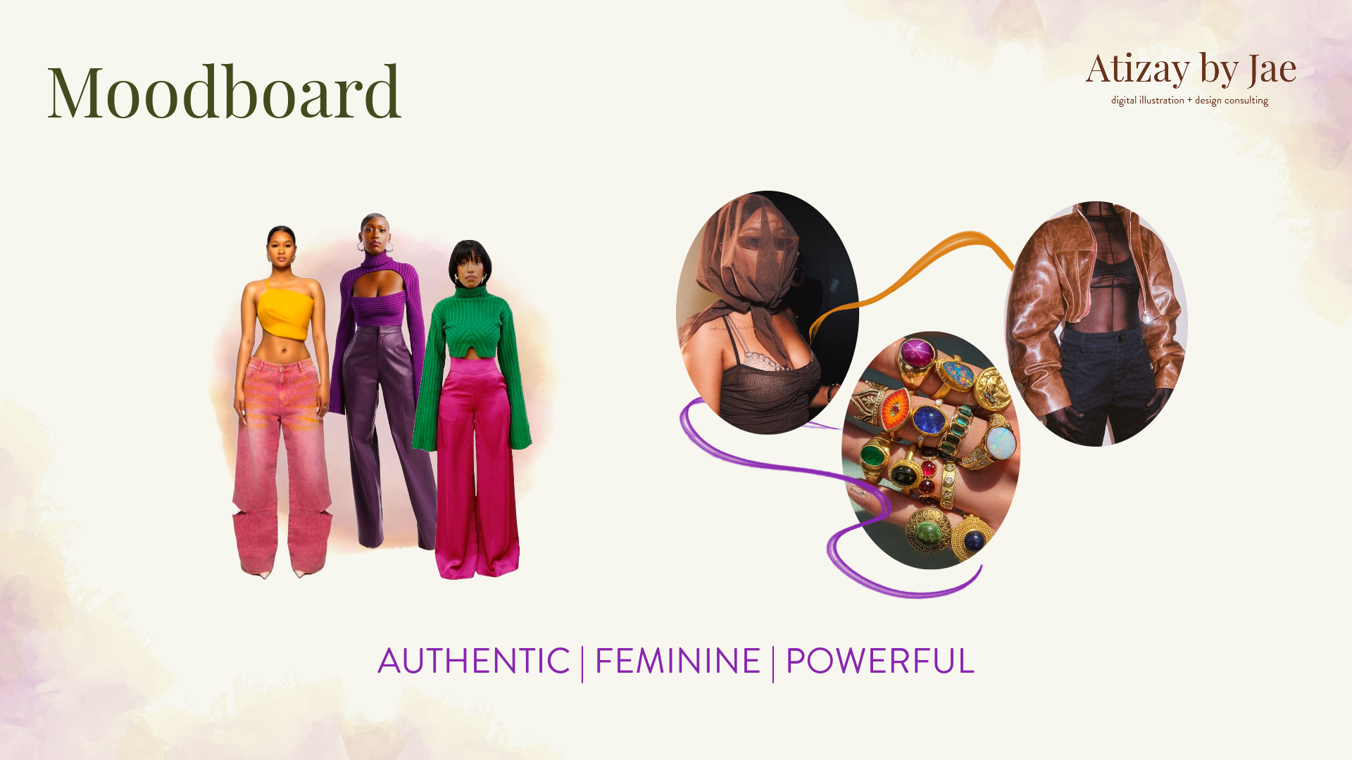
I want Atizay by Jae to reflect me in its entirety. As a creative, I often find inspiration everywhere around me, but especially in fashion. I was incredibly inspired by the Hanifa SS23 Collection–‘She is vibrant and bears witness to voluminous movement - in life and in fashion.’
My vision for Atizay by Jae is to reflect the same elements that I try to embody when I get dressed in the morning. Authentic. Feminine. Powerful.
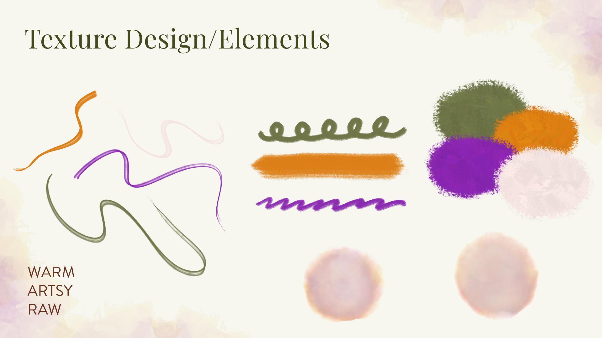
Raw colors and textures are the core of the design of
Atizay by Jae.
An earthy palette of greens, brown, and orange, with a POP of orange and purple offset by cream and pink, to combine power with femininity.
Authenticity is at the forefront of the elemental designs, not only through their raw texture, but through the fact that they were created from scratch using Adobe Fresco tools.
Instagram assets to announce my rebrand.
Fun fact: these were the first graphical assets I created for my brand. Fleshing this out led me to design the logo, pick my brand colors, establish textural elements, and settle on the typography.


